Visualization Tools
The Bucky model includes visualization tools for creating line plots with confidence intervals and maps. Maps and plots can be created at the national, state, or county (plots only) level.
Plots
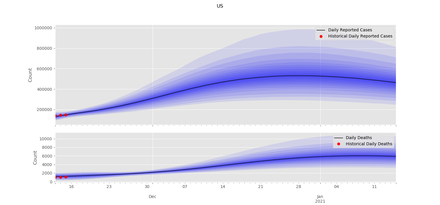
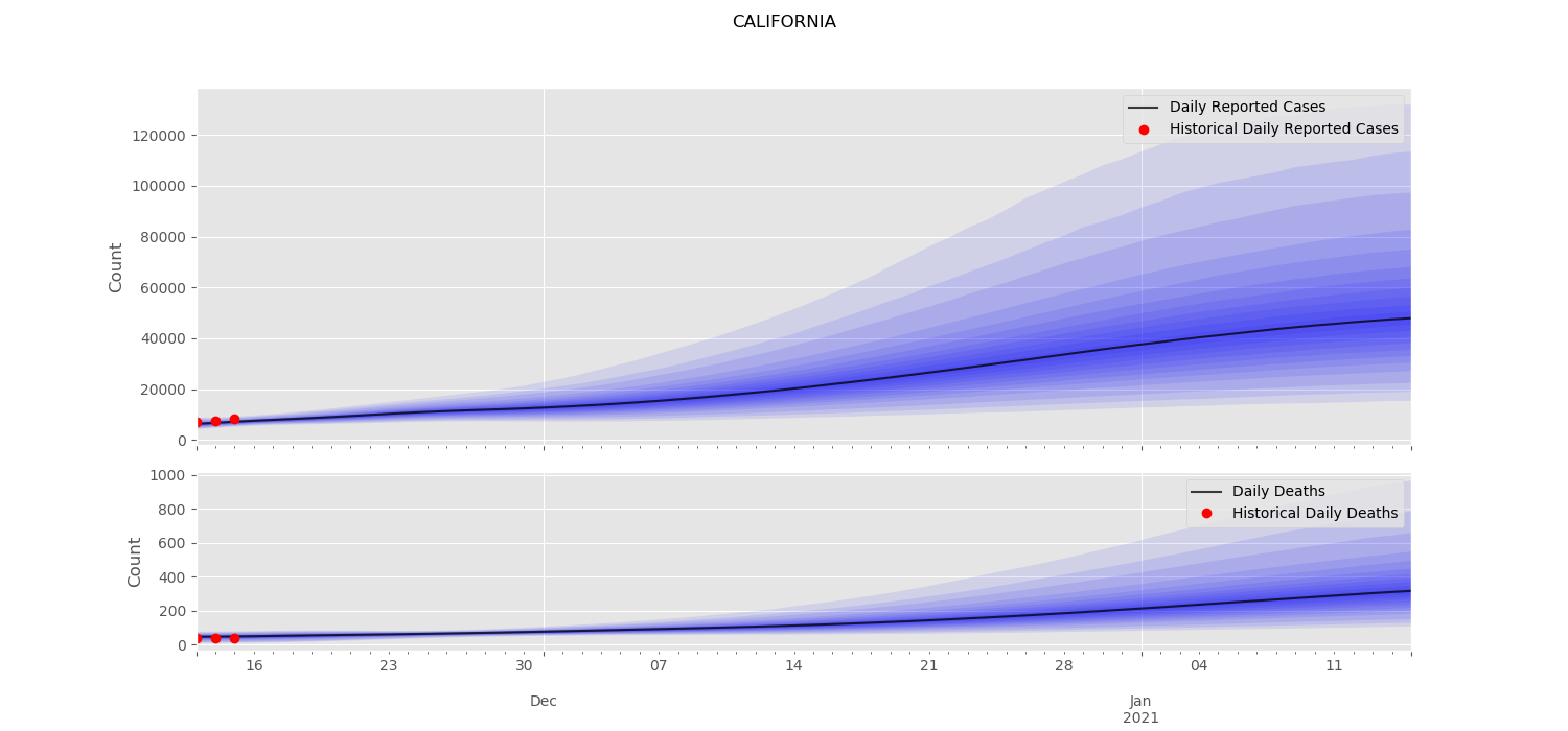
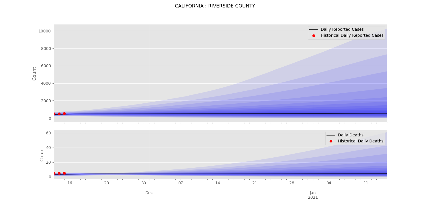
By default (i.e. without additional arguments), bucky.viz.plot creates line plots at the national and state level for the columns daily_reported_cases and daily_deaths for the most recently postprocessed simulation data. Historical data can be added using the --hist flag. For a full list of parameters and options, see TODO linkhere to documentation.
To illustrate the different available geographic levels, example plots are shown below for the United States, California, and California’s Riverside county. These plots include historical data and all available confidence intervals.
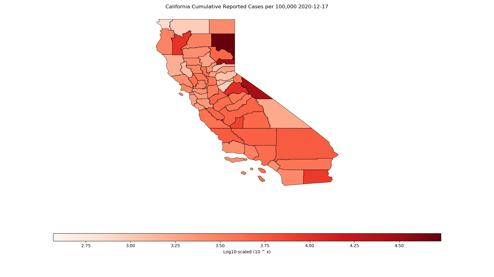
Maps
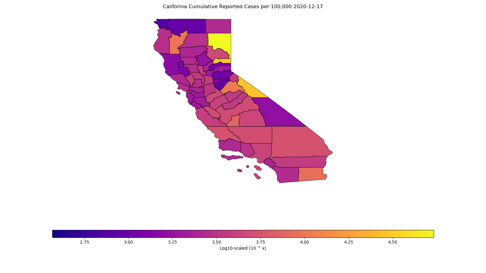
In addition to line plots, the Bucky model includes a module for creating map visualizations from simulated data. In order to create maps, the desired admin level must be supplied. Maps can be created daily, weekly, or monthly points throughout the simulation.
For example, to create state-level plots:
./bmodel viz.map --all_adm1 --columns cumulative_reported_cases_per_100k
This will create a map like the one shown below:
The mapping tool uses Matplotlib colormaps, defaulting to Reds. To use a different colormap:
./bmodel viz.map --all_adm1 --columns cumulative_reported_cases_per_100k --cmap plasma